
I got curious about a bloat problem on a customer's system today. The statistics as calculated by normal tools/queries say that one of the tables is 2x bloated. Another table is 6x bloated. And so on. For some reason I wanted to see what it looked like in a graphical way, so I threw together this simple query:
select s, coalesce(count, 0)
  from (select block, count(*)
          from (select split_part(tid, ',', 1)::int as block,
                       split_part(tid, ',', 2)::int as offset
                  from (select trim(both '()' from textin(tidout(ctid))) as tid
                          from flight_details
                       ) a
               ) b
      group by block) c
 right join (select s from generate_series(0, 28000) s) d on (c.block = d.a)
order by a ;
(This is a 8.2 system; in newer servers you can simplify the inner query a bit).
After setting appropriate parameters in psql (\pset format unaligned and \pset fieldsep ' ' and \o /tmp/population.data), I gave the output to Gnuplot using this simple script:
set terminal jpeg size 10000,600
set output "population.jpg"

plot "/tmp/population.data" using 1:2 with points
When viewed zoomed out, it looks like this:
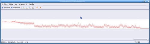
This plot represents the number of tuples in each page. The plateau at the left is a very densely populated group of pages — this is optimal space usage. Then in the middle you can see a cloud which is closer to the bottom. Finally, the straight line at the far right represents the pages less than 28000 that the table has. (The query could be refined to avoid this tail.)
Ideally you should have a bit over 10% of dead space on each page on average, if autovacuum has default parameters. In this case, there is clearly a problem after the first sixth of the table: the dots are too low. This indicates bloat in those pages.